

Lots of ways we can split this. Much has been discussed about decoupling of wages from productivity.
Also note we are absolutely not going to get into 2022. But it’s clear the price increases since the pandemic (due to supply shortages, super aggressive monetary policy, gasoline ,and other drivers of inflation) are really eating into real wages.
Real wages are wages minus inflation. Lots of ways of measuring this. PCE and CPI try to use baskets of compensation and baskets of prices of goods to figure out overall comp and overall prices of stuff.
In the US, according to the PCE method of measuring inflation and compensation, median worker wages grew by 25% over the past 3 decades, and for the bottom 20% of workers, wages grew by 33%. So this looks pretty good, and is surprising given the Millennial-doomer attitude. But wait, there’s more!
If you use CPI instead, real wages are up 20% since 1990. The Great Recession saw real wages drop, and in 2014 they started really picking back up again. The St. Louis Fed has a great graph here that actually shows the most significant increases ever happening in 2019 and into 2020… just as the labor market was really tightening up, we saw an almost 10% increase in real wages across the US over just 2 years. It was awesome. (And it follows supply-and-demand theory pretty well).
https://fred.stlouisfed.org/series/LES1252881600Q
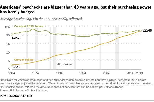
A lot of people like to tie wages back to 1970, and you can do that, too, though real wages actually dropped between 1970 and 1990, and have been rising since 1990 (with most growth in the late 90’s and late 2010’s).

So you get this bigger picture of super flat wages from the long-term, but if you zoom in from about 1990 onward, the picture is a lot better.
What’s really interesting when you dig in here, is that PCE includes benefits as compensation, and CPI does not. And because healthcare prices have gone up so dang much, and employee compensation for healthcare (in terms of covered insurance) has also gone up a bunch (though not as much), PCE makes the growth of compensation look better. So you’re getting comp’d more, but because healthcare costs are rising so damn much, you don’t feel it.
https://www.bls.gov/osmr/research-papers/2017/st170010.htm
We can see the increase in benefits here:

And neither measure includes buying houses! (Rent however is included). College also only makes up 1.5% of the CPI index.
https://www.bls.gov/osmr/research-papers/2017/st170010.htm
And, just in case someone wants to make sure I mention it: yes, the top earners have done a ton better than th median and bottom earners:

BUUUT, BUT BUT BUT:
What if you include gov’t entitlements, investments, etc? 401k’s did well, Social Security, Medicare, Medicaid, unemployment, and food stamps went up, and taxes on lower income earners went down, so spending power changes.
Using PCE and including changes in all of the above benefits, we see median real household spending power grow by 43% between 1990 and 2015 (and 2015 was when wages really started accelerating). For the bottom 20%, their spending power went up by 62% over the same 25-year period.
https://www.bloomberg.com/opinion/articles/2019-05-15/wage-stagnation-was-mostly-a-myth
Some of this seems to clash significantly with the sense we have that everyone is economically frustrated. If you’ll allow me to speculate: housing prices, healthcare prices, and education prices have skyrocketed, significantly faster. Buying a house is a major path to economic stability, and a lot of people have been priced out (due to housing prices going up faster than wages). So they keep sinking money into student loans, rents, and unexpected healthcare costs. So even though their incomes can buy them more food, cars, trips, electricity, etc, we have these big, seemingly unproductive sinks that really clobber us. That’s my guess.
This is supported by the fact that the housing price to rent ratio has absolutely skyrocketed over the past 10 years:
https://www.statista.com/statistics/591978/house-price-to-rent-ratio-usa/ (so you can afford to rent, but you can’t afford to buy)
- Rent as a percentage of income
You might not believe it, but for most Americans, the percentage of their total consumption taken up by rent has only increased a bit since 1985 (again, only through 2020). Rent is toughest for lower-income earners, though — about 34% to 44%, and that’s no good. But for the middle group of income, it’s gone from about 26% to 29%. We’d want this going down, not up — people should be able to afford more house over time, not less. So this means its’ getting worse, but not crazy-worse.

Unfortunately… in about mid 2021, rent started absolutely exploding. And we’re feeling a ton of pain about it. There are three key reasons:
- Construction harder due to supply chain issues
- People moving out of certain areas and into others, and the other areas are becoming dilapidated rather than moved into, so housing stock is dropping (see: Detroit after 2008).
- Most importantly, maybe, is low interest rates and therefore high P/E ratios and therefore lots of people flush with easy cash looking for assets to put the cash into. Hayek is spinning in his grave.
https://www.statista.com/statistics/1063502/average-monthly-apartment-rent-usa/
- Home Ownership
OK this one is super interesting. Form 1990 to 2004, home ownership went up from 64.1% to 69.2%. Then from 2004-2008, it dropped a bit, and then crashed from 2008 all the way to 2016, down to 63.7%. And then it started climbing back up to 65.8% (nowhere near the 2004 high), before the pandemic hit.

https://www.statista.com/statistics/184902/homeownership-rate-in-the-us-since-2003/
- Medical bankruptcies
Medical bankruptcies in the US are in a way a bit ridiculous. They are a major driver for about ⅔ of all bankruptcies, which is just crazy. (Compare to Canada, where it’s 15%, and in the UK it’s 8.2% though interestingly the US total bankruptcy rate is about 20% lower than Canada. Weird)
Between 2011 and 2018, it seems the rate of Americans who couldn’t afford their medical bills actually dropped from 20% to 14%.
Problems are of course much bigger than just bankruptcy: a lot of families bear medical debt, take out mortgages, cut other costs. How have these changed? Let’s look at the period since Obamacare and etc (including expansion of Medicaid).
We do know that total debt collections dropped significantly over the 2009 to 2020 period, and this includes medical debt, though medical debt collections dropped less than other forms of debt collections. States that expanded Medicaid performed 34% better than states that didn’t.
https://siepr.stanford.edu/news/americas-medical-debt-much-worse-we-think
Having trouble finding a great long-term graph, but 2018-2021 showed a 10% decrease in the balance of medical debt ($97B to $88B):

Another interesting fact here: those over 65 are actually far less likely to have medical debt (about 10% vs. about 20%), which maybe says something about Medicare working out pretty well.
https://www.census.gov/library/stories/2021/04/who-had-medical-debt-in-united-states.html

- Child Death
Health-related death down, homicide down, unintentional injuries (primarily vehicles) WAY down; suicide creeping up which is terrifying

- Illegal immigration
Declining or flat since 2007. In 90’s it exploded, slowed in 2000’s, and went into decline throughout the OBama presidency.

https://www.statista.com/statistics/646261/unauthorized-immigrant-population-in-the-us/
Since 2017, numbers totally flat (despite a dip in 2021).
https://cis.org/Report/Estimating-Illegal-Immigrant-Population-Using-Current-Population-Survey

Some come in, some go out, is basically it. Bigger drop between ‘19 and ‘21 likely due to pandemic. It looks like from Jan ‘21 to Jan ‘22, there was indeed a huge spike that was the sortof “border crisis” we saw.
Not clear how much policy affects this, as the numbers are all just so dang flat.
3 Comments